The Ultimate B2B Website Guide
(B2B Web Design Playbook & Examples)
Author: Sam Dunning ✪ Date: March 15th 2024
A Winning Website Guide
Many of us invest our time or money on marketing or advertising to drive people to our website in the hope they will convert from browser to an inbound opportunity (qualified sales calls or demos).
Sadly a lot of websites are built to stroke ego’s (namely some CEO’s or marketing execs) and look pretty, rather than work hard to grow your business and supply a steady flow of qualified leads.
Your website can be your very BEST or very WORST salesperson as it’s live 24/7.
Worst:
- Takes ages to load
- Poor design
- Talks about how good the product is
- Main value prop is how many awards/accolades won
- Offering is confusing
- Hard to get in contact on your chosen channel
Best:
- Loads super fast
- Design is crafted for ideal clients
- Clearly showcase what you offer and how/who you help
- Provides useful resources to answer customers questions
- Content talks about how the product/service helps/solves problems
- Easy to contact/buy, no matter what area of the site you're on
Top B2B Website Deadly Sins
1. Lack of research
Great websites aren’t built on guesswork.
They plan out exactly what they want ideal clients to see, learn, feel and take action on.
2. Designing for yourself
You aren’t your buyer.
Design key pages around what your focus prospects wanna see and learn about.
3. Slow page speed
Poor page speed is a killer of conversion.
Aim for close to 1 sec page speed.
Or let competitors enjoy your frustrated visitors.
4. Unclear messaging
You won awards?
So did every other company.
Cut the bragging and jargon.
Share what your buyers care about - fixing problems, improving their business and life.
Get common questions or objections?
Address them in your page copy for each relevant offer, along with using FAQs.
Handling these early = more conversions.
5. Hiding pricing
Optimising for ‘leads’ or MQLs?
Stop it.
Share your starting rates rather than forcing people to speak to sales who can’t afford your offer.
6. Ignoring SEO and marketing
“Build it and they will come” - doesn’t work for your website.
You need to market it actively on the channels target prospects hang out on.
If you’re in an established sector, people are searching for your offer on google.
If you aren’t, work out channels your prospects go to get trusted information.
7. Setting and forgetting
Websites are 24/7 sales reps when done right.
You can use analytics, heat maps, customer feedback and more to keep improving copy, design and conversion rates.
8. Zero proof
Social proof FTW.
Back up your claims on key pages with relevant case studies, testimonials, customer video reviews and more to build trust with visitors.
9. Hiding the goods
People wanna see the offer in action.
Especially in SaaS.
Interactive demos, GIFs, video tours - give a sneak peek before you force a call w/ sales.
10. No calls to action
Have clear CTAs for prospects to book a demo/contact/book a call.
Use a booking tool like chili piper/calendly/hubspot for easy call scheduling.
If you want actionable takeaways for all angles of your website to hook leads from ideal buyers and make your website a conversion machine...Read on.
What makes me qualified to write the ultimate b2b website guide?
12+ years of b2b websites for startups through to global brands. Launched 310 + sites and learnt the hard way for what does and what doesn’t work.
Host of top 10 b2b marketing & demand generation podcast and founder of a B2B SEO Agency and B2B Web Design Agency.
I’ve interviewed 300+ b2b marketing, sales and business execs to know what they care about seeing on a b2b website. And often featured/partnering with leading b2b publications & brands like CXL and Ahrefs etc.
Plus we eat our own dog food, we test different theories on our website design, copy, layouts all the time along with different marketing channels to see what converts leads and what doesn’t.
Enough rambling, let’s get stuck into the good stuff with your b2b website guide!
First off, it’s not about you. Design your website for ideal customers
As I alluded to earlier, the worst thing you can do is to design your website around what you or your team like and think works (unless you are your ideal client). You want a website that will hook your ideal customers into juicy leads you or your sales team can work into new business.
So how do we craft a website for our ideal customers you ask?
Here’s the way I recommend.
First of make sure you know exactly:
- Who is the ideal client/target market you want to attract?
- The action we want them to take on the site? E.g. request a demo/book a call/download a guide/call now/fill a form etc?
Now comes the spicy part, it’s time to talk to customers. But not just any customers the ones that you really enjoy working with (not a pain in the a**) and most importantly they drive profitable revenue for your business.
Make a list of 10 or so of your very best customers and ask them for 15 minutes of their time for an interview.
Here’s a script you can steal…
“Hey [Name],
Appreciate your business over the last [X months/years],
We are interviewing our valued customers to ensure we give you the best possible service and understand any gaps we can improve on.
Would you be opposed to spending 15 mins to help us both this week or next?
Cheers,
[Your name]”
Ideally you want to record this on zoom/skype/teams or a video call, if not do a phone call, worse case you send the questions via email.
Your customers are about to share with you a GOLDMINE of information to help you.
Ask them:
How did you find us?
- Why we are asking: Useful to know how your best customers research a company like yours
What specifically made you decide to work with us as opposed to the competition?
- Why we are asking: This can aid your content and give you your value proposition
What problem did you come to us with?
- Why we are asking: Again helps with content/headline/determining the main problem people come to you with
How did we help you fix it?
- Why we are asking: To use for copy and can be mentioned in your process/sales conversations
What is life and business like for you now you have our solution and we fixed [problem]?
- Why we are asking: This is to help build case study material and understand how your product/service really helps people
What is most important to you when looking at a website of a company in our sector?
- Why we are asking: So we know what our ideal clients really want to see on a site like ours
How easy is our current site to understand how we help you? (if you have a current one)
- Why we are asking: To note any flaws in our design/navigation/contact process for customers
How easy is it to contact us on our site right now?
- Why we are asking: To learn what needs improving
What could we improve on our site?
- Why we are asking: Again valuable intel to know what is missing
Next:
Review all your call recordings or email discussions and make a list of the most common replies against each question. This is the good stuff you know needs looking at.
How these interviews help you:
- Web copy: How many times do you go onto a website’s homepage and see a bunch of jargon (tech companies looking at you) and are left none the wiser of what they actually do e.g. the headline might be “We Give A 360 Composition Into Comprehensive Data Intelligence”. By asking your customers the above questions you can use the real ‘insider customer jargon’ they use to describe your product/service and how it helped them. This can help to ensure your copy resonates with ideal buyers
- Design pointers - Several customers might say they want to see a team page, or your homepage wasn’t clear on what you do, or your contact form is too long etc. This is gold dust to work on
- Testimonial videos - chop up the video clips for testimonial videos for your website/YouTube/social promo
- Improve your customer service - Your customer will share what’s important to them, meaning you can serve them better and drive more revenue long-term
- Some points may assist your marketing messaging too
Put the most common answers into a list or spreadsheet and be sure to implement these into your site.
Keep talking to your best customers from now on - always things we can learn.
Other options:
- Incentivised email surveys e.g. free coffee or discount for completing a survey
- Install hotjar on your website (heatmap and survey tool) they have a free version. Set up a survey on your site similar to the above questions
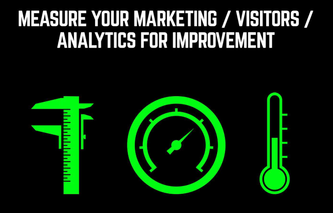
Install Google Analytics NOW (& get it setup right)
The old saying “what gets measured gets managed” is pretty true. How can you know how well your site is or isn’t performing right now if you don’t have analytics installed.
Ask your developer to install Google Analytics if it’s not yet and to track:
- Traffic Volume
- Traffic sources
- E.g. Organic SEO, Google adwords, Facebook ads, LinkedIn, Instagram, Email marketing etc.
- Conversions (leads - see below)
- Bounce rate (how many people only visit your homepage and go off to another site, lower percentage here the better)
- Average session times on site
- Mobile and desktop usage percentages
- Audience location - so you can check your marketing is reaching the right audience you want to attract
And set-up Goals in Google Analytics for the following conversion points so you can track, measure and report your leads each day/week/month/year:
- Click to calls
- Click to call (when someone clicks your phone number
- Enquiry form submission (set ‘thank you’ page as a goal)
- Demo form submission
- Lead magnet download e.g. guide or whitepaper
- Sign-ups
- Chat bot starting
Now you can effectively report on what is going on with your web traffic and lead conversions.
Why page speed is the silent KILLER of your website conversion rate
Your site page speed can lose you leads & revenue without you ever knowing about it
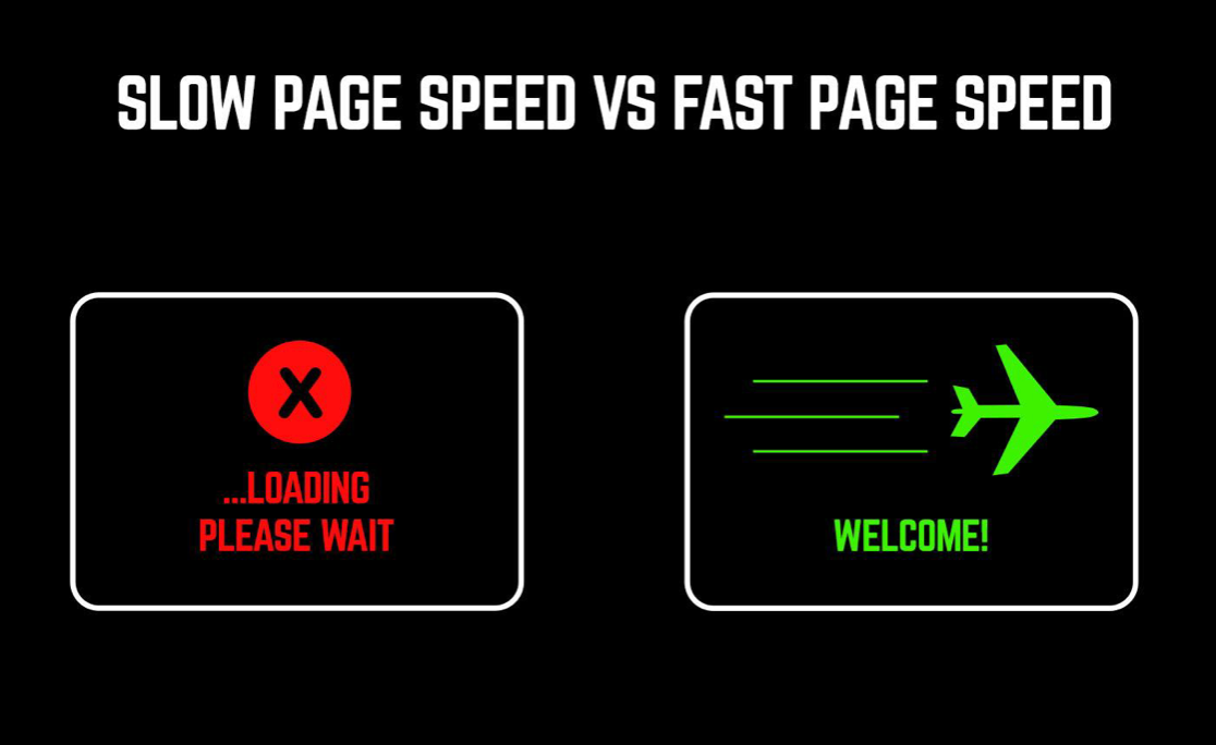
If your site takes over 2 secs to load, you'll be p*ssing people off. They won't stick around to see your great design, content or ever have a chance to become a lead and potential customer. Meaning you have wasted your marketing/advertising time or spend.
People will simply head to a competitor that gives them a fast-loading and better experience.
Ideally you want your site to load in one second or less.
Mobile search is starting to steadily creep further and further ahead of desktop search, so your website needs to be lightning fast for both in order to not lose your hard earned visitors.
First off, head over to Google PageSpeed Insights and enter your website address and get your score (out of 100) for mobile and desktop view.
Ideally, you want to get 90+ for both desktop and mobile.
The good thing about PageSpeed Insights, is it gives your both the score and a list of areas to look into to improve speed that you can bring to your website development team.
Some ideas to help keep your site fast:
- Remove any out of date or unneeded plugins
- Avoid budget hosting (e.g. shared hosting or low memory, low bandwidth, cheaper options)
- Go steady on huge imagery
- Minimal animations
- Have thumbnails that click to load videos
- Ask your developer to keep front end code light-weight
- Check your site speed now on PageSpeed Insights
Your Homepage
So the design should be taking in mind what we have learnt from interviewing/surveying customers from the earlier step.
Plus we want to follow a few best-practices I will now get into...
Hero area
In many cases your homepage will be the first impression people get of your business and site. (unless you have blogs/service pages ranking on Google or they go to a landing page).
Your homepage needs to work seriously hard for your business and it has a very limited amount of time to do it in. If it doesn’t give people what they want/need, they will make a swift exit and this will increase your bounce rate.
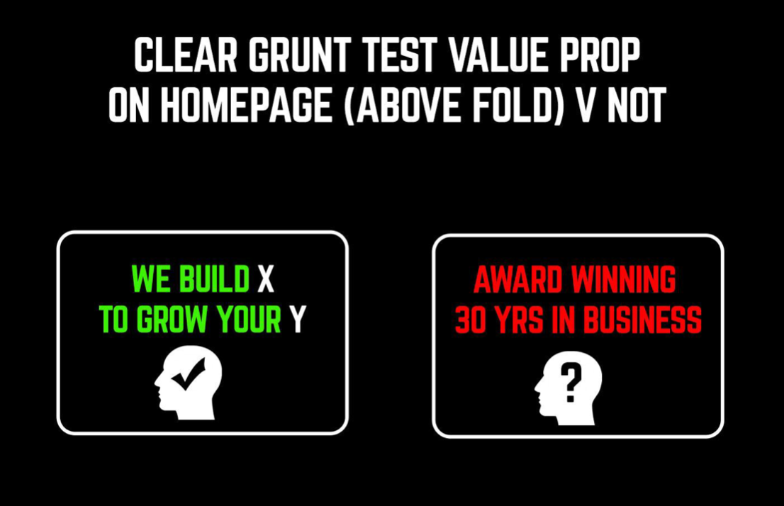
As soon as someone lands on your homepage hero area (top part before scroll down on mobile and desktop) they need to be able to understand exactly:
- What you do
- How you can help them
- How to take to book a call/demo or learn more
If people can’t do this within a couple seconds of landing on your site, your website isn’t hitting the mark.
The above test is called The Grunt Test. If a caveman couldn’t be given a laptop with your homepage right now and grunt what you do, how you can help and how to contact/buy from you, then your website has failed.
Coined (as far as I know) by Donald Miller. I highly recommend his book, ‘Building a StoryBrand’ truly a must read for anyone in business or marketing.
Want to test this? Put your site in front of a relative/friend who’s never seen your site before and have them answer the above 3 points, if they get it wrong, your website hero area and content needs work.
Let’s talk about your homepage headline, here are 3 headline styles you can use. In this case I am talking from the angle of a accounting software SaaS company as an example:
1. Problem centric
Frustrated [common problem customers bring to you] isn't [achieving desired result]?
Example: Tired of spending hours on excel building accounting spreadsheets?
2. Benefit driven
We do [X] that benefits [Y]
Example: We provide accounting software to create invoices in seconds
3. Pick a fight
Pick an issue in your industry and double down on it.
Your [sector] company pushing [most frustrating issue in your industry] on you? Let's talk [what matters most to your customers].
Example: Is your accounting software slow and painful? Let us run your monthly accounts in just a few clicks.
Or, here’s 3 I made up for us at Breaking B2B:
1. Problem centric
Frustrated [common problem customers bring to you] isn't [achieving desired result]?
Example: Frustrated your website isn't converting your hard earned visitors into leads?
2. Benefit driven
We build [X] that increase [Y]
Example: We build custom, websites & SEO strategies that generate leads and sales.
3. Pick a fight
Pick an issue in your industry and double down on it.
Your [sector] company pushing [most frustrating issue in your industry] on you? Let's talk [what matters most to your customers].
Example: SEO agency promising the earth and delivering jack? Let's talk driving revenue.
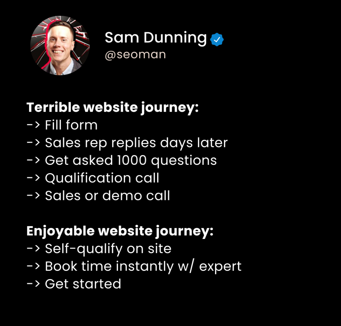
After your headline you want your main CTA (Call To Action) giving people a quick way to contact / take the desired action you want them to take. Make your primary CTA button a different colour, so it stands out from the rest of your website.
Here’s an example of our site homepage on mobile view before scroll:
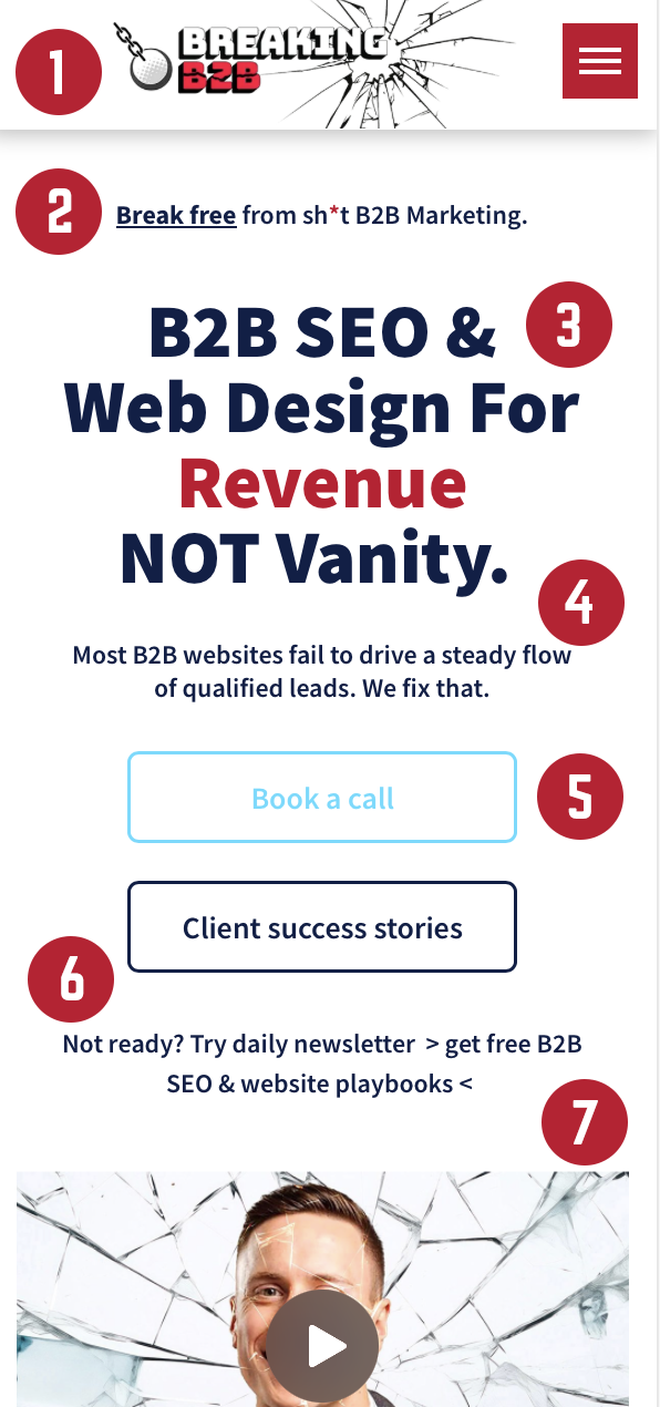
Here’s my framework
(see image left for reference)
1. Sticky fixed menu nav.
2. Tagline on what we stand for.
3. Headline on our offer, why we’re different and who we serve in one sentence.
4. The problem with our industry and how e fix it (take a stance).
5. Next step CTA + see more CTA
6. Light CTA if not ready to grab free resources
7. Video summary/taster
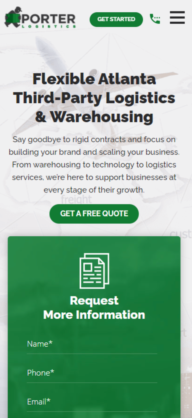
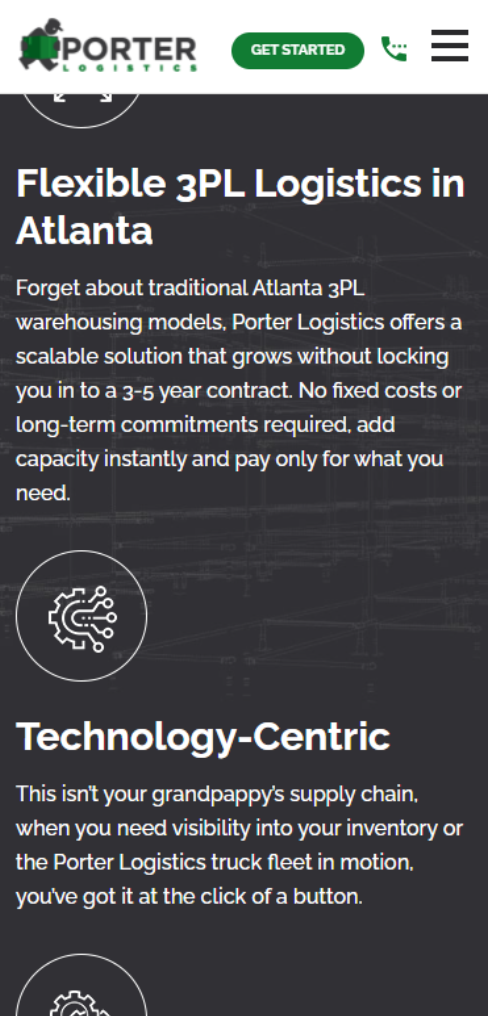
Here’s another example for a client: Porter Logistics
These guys have a clear, benefit driven headline, CTA button and then an enquiry form all before scroll, which can work too.
Below the fold:
As people scroll down through your homepage they need to be able to get a clear idea of your product/service/benefits and how it can help them.
If you’re in SaaS or tech, people wanna see your offer in action fast before they are ready to book a demo or speak to a salesperson.
The copy/imagery should be focused on how your offering helps people, not how great you or your company is.
I recommend having social proof in between areas of text / imagery etc. as people scroll down your homepage.
This could be a testimonial area/slider, customer interview video, accreditations, brands you work with or reviews.
Example of client logos on homepage
(mobile view):

Testimonials area
(desktop view):
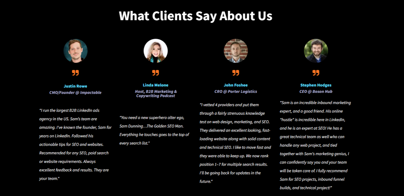
Don’t limit social proof to just your homepage, leverage it throughout your website to build trust and convert more visitors to take action and get in touch with you.
Several CTA buttons strategically placed throughout your homepage as people scroll down is a good move (again this works for all pages of your site) - this makes it super easy for people to contact/get in touch with you or take the action you want them to take.
I recommend keeping your primary CTA button the same colour/message (not essential if you have several actions you want to guide people to on your site/pages).
Why does social proof work? Humans are creatures of habit. We like to buy what we know has worked for other people.
Just like when I am walking the streets on holiday with my family on a warm summers eve, searching for the best restaurant to go for dinner...do I go for the one with no one in? Nope. Most of the time, I am going for the one where they have strategically places people at the front of the joint, making me think it’s a great place to eat at. Social proof isn’t all that different.
7 Must Have B2B Website Pages & Recommendations
1/ Homepage - should share:
- What you do
- How you help
- Problems you fix
- Gifs/examples/screenshots of
- your offer in action
- Guide people to
- contact/demo/learn more
2/ Results or Case studies page - should share:
- Time to back up your claims
- Customer testimonials with headshots
- Video reviews
- Accreditations/wins
3/ Pricing
To qualify in good fit prospects and show transparency. And send quality leads to sales.
Share ranges of top 3 offerings if you don 't have set rates.
Back up pricing with social proof Address common objections Answer common questions on pricing and process.
4/ Service Pages
To show how how each offer you provide helps people.
Build out pages for each key offer/feature/industry/location served.
Give visitors key summary of each solution + benefits + problems they fix + social proof + call to actions.
Great for SEO.
5/ About page
Not to boast about your company. Share your founder and the problems you help companies fix. Share a couple useful resources. Guide people to take the next step.
6/ Contact/ Request a demo
Have enquiry/demo form before scroll Only ask for key fields needed. Consider a calendar booking tool e.g. RevenueHero
Place story based testimonial next to form to address buyer anxiety of contacting you and share what happens on the call.
7/ Thank you page:
To show once a call/demo/consult form is completed. Often neglected on sites.
Share what happens next e.g. named sales rep will be in touch within 12 hours
Link to a couple useful resources (podcast/guides).
Excite your prospective customer before they even speak to sales Track thank you page on analytics
8/ Spicy Extras
People wanna see your offer/service/SaaS in action.
Show them under the hood e.g. live demos on-page, GIFs, screenshots, video, reviews, proof of work (if serviced based B2B company).
Let them build confidence in your offer. Encouraging a sales convo.
A few general good practises
Sticky Menu for Mobile and Desktop
This is one of my favourites. This means your website is stuck to the top or bottom of your site no matter where people are or what page they go to.
Why is this a good idea? It makes your website navigation easily accessible and you can put your primary CTA as a button in the menu and even a click to call option (if you want calls) or your email - making it simple for people to contact you.
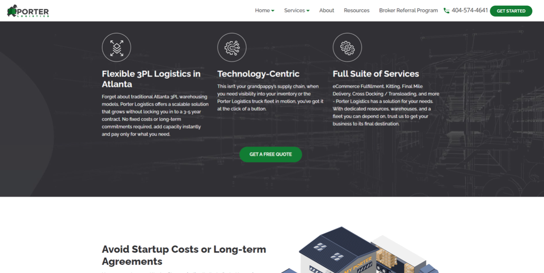
Above is an example of a sticky menu on desktop, halfway down a homepage (Porter-Logistics).
Ultimately, we want to make it as fast and painless as possible for people to get in touch with us throughout our entire website. Sticky menus really help with this!
Here it is again on mobile view. You can see in the top menu (in order) Logo, CTA linking to enquiry form, click to call icon, menu navigation button (opens menu page links when clicked):
Give people ALL the options
Not all so different from the above, give people a range of options to get in touch with you. Just because you prefer email or call, it doesn’t mean your customer does. Options might include:
- Phone/click to call
- Enquiry form
- Book a demo/call
Descriptive CTAs
Instead of having your main CTA button as ‘Contact’ or ‘Enquire’ let people know exactly what they get by clicking the button e.g. ‘Get My Free Quote’ or ‘Book My Custom Assessment’ - leave no doubt as to what people get by taking action.
On-Site SEO
OK before we dive into more pages, let’s cover one of my favorite ways to drive traffic to your site, Organic SEO (Search Engine Optimisation).
According to BrightEdge 68% of searches start with a Search Engine. And as Google as by far the market share for many countries, having your site rank on it is a good move.
Here’s a breakdown to put your website in a great spot before any off-site SEO work (link building, content distribution etc).
Step 1: Keyword research
This is where you select the keywords you want your site to rank for on Google.
Make a list of the main products/services you want to generate leads for. Now head over to a tool such as:
- SEMrush
- Ahrefs
- Ubersuggest
- Google keyword planner
These tools give you insights such as: Traffic volume each keyword gets per month (via location), the websites currently ranking for the keyword, the competitiveness and related keywords.
If you are a small business managing this all I recommend sticking to 10-20 keywords (search terms) so you can grow this with your content over time. If you have a marketing team or external SEO agency then of course you can go much bigger.
Whilst going for keywords for people wanting your product right now is great, these can also be very competitive. Think about the different stages of the sales funnel with your keywords e.g.
- Top of funnel (not aware of your brand yet)
- Middle of funnel (comparing options)
- Bottom of funnel (ready to speak to sales)
Let’s use an accountancy software company as an example.
Here’s what a prospect might search at each stage of the sales funnel:
Top of funnel (awareness stage)
‘5 things to consider before investing in accounting software’
Middle of funnel (research stage)
‘Compare accountancy software’
Bottom of funnel (ready to talk to sales)
‘Best accountancy software’
Or
by now they may search direct for your brand
Other things to consider when doing SEO keyword research
- Relevance of keywords for your product/service
- Competition of your target market
- Global/Location specific services
- Search volume of target keywords (high volume is good BUT if you are in a niche offering, lower volume can be good if the keyword is exactly what someone would type in to find your offering)
Stuck for ideas: Check out what search terms your competitors are ranking for using the suggested keyword research tools above.
Step 2. Technical Audit & Implementation
Now you’ve chosen your target keywords you need to assess your website from a technical point of view AND make sure that the search terms you’re targeting send people to the page that gives them exactly what they are looking for.
Google loves fresh, relevant, helpful and informative copy. This means whilst your homepage may be great for some search terms, for others, information / service / article pages may be a better fit.
Here’s some key considerations for SEO and providing a solid User Experience:
- Page title tags: The page title (first line) you see a Google results listings
- Description Meta Tag: This is the description you see when you see a search engine result under the page title.
- Image Alt Tags
- Anchor Text For Internal Links
- Header Tag Optimization: Heading tags from H1 to H6.
- 301 Domain Redirects.
- Favicon Optimization: This is the square icon you see in your browser tab.
- Install Google Webmaster Tools
- Important Pages In Root Directory: All important pages of the website should be in a root folder (Directory).
- Footer Links: Footer Links on Website with Keywords as Anchor text is important with respect to search engines. It helps search engine crawlers and users to navigate internal links without ease.
- Search Engine Sitemap (XML Sitemap)
- HTML Or User Sitemap
- Easy menu navigation
- Clear CTAs
- Fast page speed
- Mobile First design
Step 3. Content Audit & Implementation
Once your website is technically sound, we need to make sure the content is on point. We want each page to answer all our prospects' possible questions, talk about how we solve their problems/make their life or business better and be SEO friendly.
If your site is a single page scrolling site, the chances are its not gonna rank too well on Google. Instead with a lead-gen site, you’ll want multiple pages for each service/product you offer.
Make sure each of your information pages is content rich with consistent and regular CTAs throughout so people can easily contact you as they scroll through each page.
For service/article pages as well as text you can add: Videos (I recommend images that you click to then open video to keep page speed fast), infographics, images, podcasts, adn FAQ section, meme’s, GIPHs etc. to keep people engaged and entertained on your content and eager to learn more.
If I got into off-site SEO and link building, this guide may be never ending and lose the key focus (could be a future guide)! You can check out the video at the top for more on and off-site SEO.
Let your website answer your prospects questions
(Yahoo! Ditch the endless PDFs and emails)
Do you get tired of the same old questions every week from prospects/customers? Your website can solve this, plus it will help with SEO and build trust & confidence with your visitors that you are the company best qualified to help them.
Here’s how your website can generate you more revenue and save you time on the phone answering questions or emailing PDFs/guides/literature to customers…
Step 1:
Build a list of the most common questions you or your sales team (if you have one) get from customers each and every week without fail. E.g. How to do X, Best ways to do Y, What is the best Z etc.
We are building this list because we know there is demand for these questions and other people will ask them in the future.
Step 2:
Create a long-form pillar piece of content for each question in your most asked questions list. This could be a video, a podcast, a page within the FAQ section of your website or a blog article. I recommend Googling the question, check out what the competition is doing and look at gaps where you can make your piece of content more detailed, helpful and educational for people (to one up them in all ways possible)!
Step 3:
REPURPOSE. Now you have a big juicy, detailed pillar piece of content you can cut up the golden nugget/key takeaways/best bits into pieces of micro-content.
E.g. A specific topic on a video can be made into: A blog article / LinkedIn or Social post / infographic / Page for FAQs and more.
As an example a lot of the videos I make on my YouTube channel our team then create into blog articles, I will chop up for LinkedIn and for the podcast to make the content work harder to build brand awareness, show sector expertise and drive leads for our business.
Step 4:
SEO
- You can weave your target keywords (only if relevant) onto blog articles or FAQ pages etc. on your website. Do not stuff keywords in though, it needs to read well and smoothly.
This is now gonna provide useful resources on and off of your website to hook leads for the long term through evergreen content (that will stay on the internet for the foreseeable future), it means you can send people to the piece of content to answer their questions, it places you as the trusted company for people at different stages of the sales funnel, it will save yourself and team time, plus it will help with SEO!
Pricing Page - A Deep Dive
Pricing pages are a great way to qualify out bad fit prospects and bring on board customers who have the cash to do business with you...all whilst reinforcing the value you bring to the table.
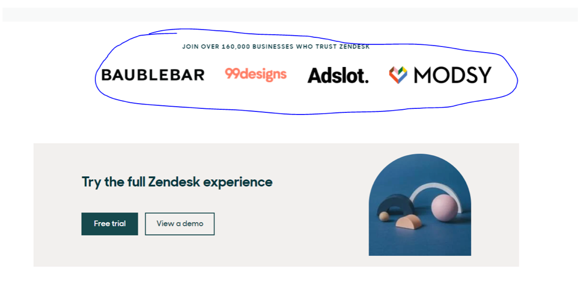
Zendesk does a pretty good job with their pricing page:
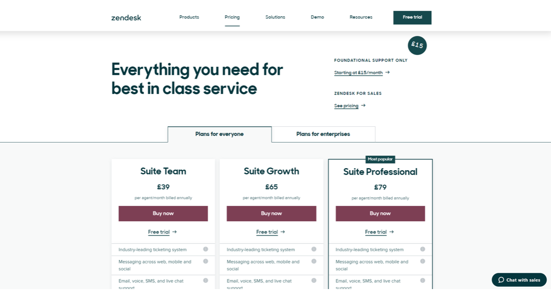
They have 3 clear plans with the key benefits of each.
They back it up with social proof ‘Join over 160,000 Businesses…’ and show logos of their well known clients.
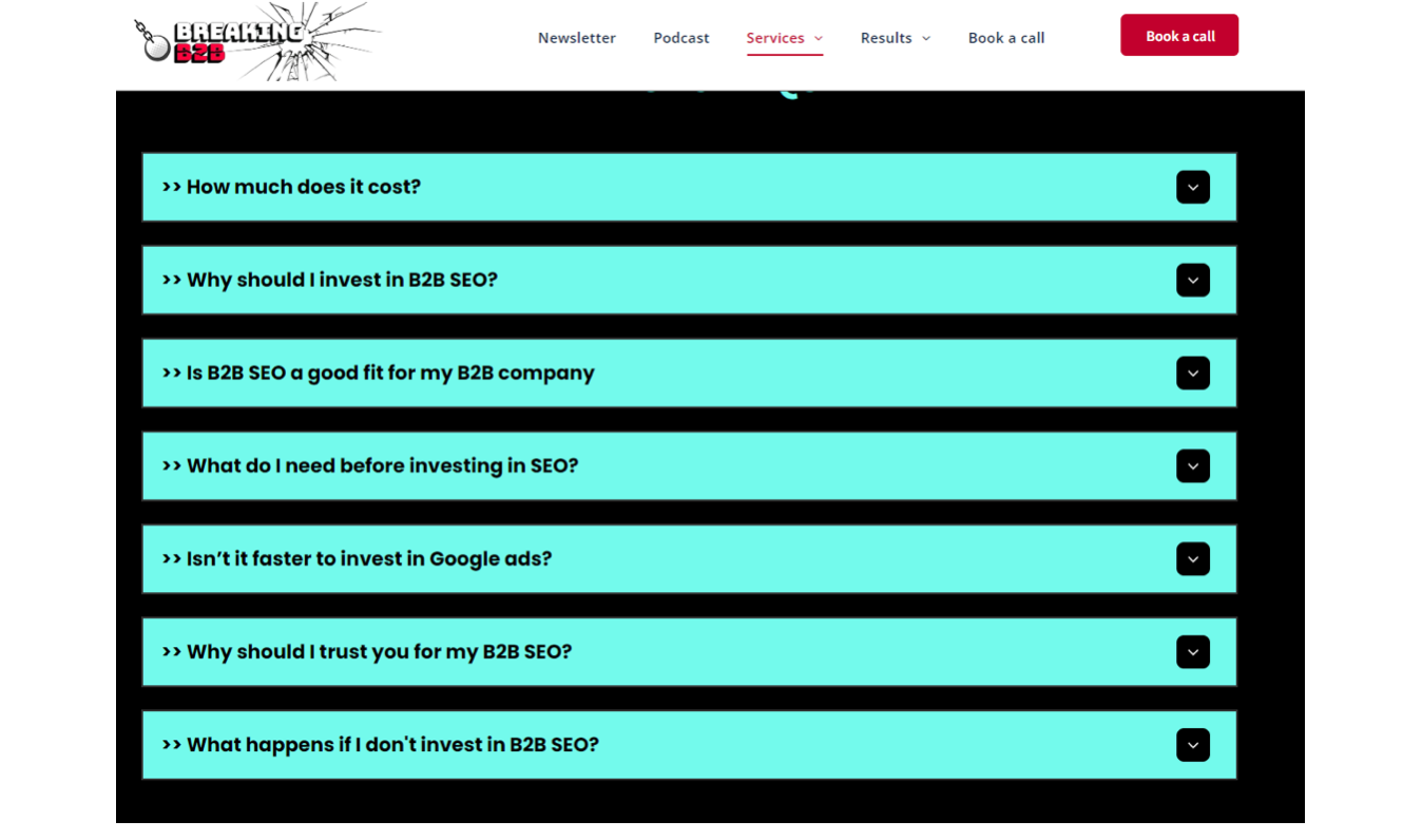
Then they put your mind at rest and answer any potential questions with an FAQ’s section:

FAQs are solid to address questions you get from sales calls along with common objections, head on. Saving your sales team and prospects time.
Here’s an example we use on our B2B SEO page, addressing common sales call questions:
People need to trust you will do them a great service before they agree to talk to sales and part with their cash.
A well designed pricing page that gives people options, covers all the benefits you bring to the table, answers questions and backs it up with social proof makes all the difference.
They are often one of the most visited pages, too.
Lead magnets
Even the best performing websites don’t tend to convert much higher than 10% of their traffic into enquiries.
So with that in mind, it makes sense to do all you can to hook leads, right?
Lead magnets are a great way to do this.
A lead magnet could be:
- A video series
- A ‘how to’ guide
- A ‘best practise’ guide
- A podcast series
Essentially you provide a valuable asset to your prospect usually in exchange for a small amount of their info e.g. name / email (rather than a detailed form-fill).
Are these red hot leads, usually not.
BUT with some nurturing over time with useful and helpful content via email / social eventually guiding them to a call, or whatever next step you want them to take...they can become warm leads.
Lead magnets are a great way to capture ‘top of funnel’ leads that can be nurtured into customers.
Things to consider for any website changes
Not everything will work for you. The best idea is to make small changes at a time, see if the results are positive by looking at the data and conversion rates in Google Analytics (and of course by how many leads you get) and then making tweaks based on what does or does not work.
For example, changing your main call to action is a big thing, give it a few days after to test the results, likewise with homepage headline or hero area changes, do them one by one to see what the results show.
Your website should be something you constantly measure and there are always areas that can be improved and added to especially the content to keep regular updates for visitors and Google.
Driving traffic to your website
The world's best website is useless if no one knows it exists. You need to be marketing your site on the channels your ideal customers hang out on.
Here’s what we do at to get our own inbound leads, and for our clients too:
SEO - Most people start their buying journey with a search engine, typically Google. If you can get page 1 organic results for the main product/service people are searching to find what you sell, long-term - you are onto a winner.
Google AdWords - A quick way to get onto the top of Google for your target keywords. You pay every time someone clicks your ad. Can work well with SEO and give you two bites at the cherry of winning someone over to your website.
Facebook/Instagram Ads - Typically cheaper cost per click than Google AdWords, but usually (not always) a lower conversion rate, as rather than people directly searching for your offer, they see it while scrolling through the feed.
Sponsored Ads - On industry relevant directory/listing sites e.g. G2, Capterra, Clutch etc.
LinkedIn - I post content daily to build my personal brand, share useful tips on websites & SEO and direct people to our website.
Podcast - We have advertisement slots for the business again to build brand, get traffic and leads
Email newsletter - Providing weekly helpful/educational content to our email list generated via past customers, lead magnets and previous leads
Referrals - From past customers and happy clients
Other social channels.
Useful Tools / Recommendations
I recommend you hook up all your traffic / enquiries / calls / lead magnets to a CRM so you can easily keep track and manage all leads that come in via your website, rather than getting endless emails and losing track of your website results and sales opportunities.
Hotjar - Great tool to see user sessions, website heatmaps and run surveys.
Google Analytics - To measure key website metrics.
Thank you for reading
I appreciate you reading my b2b website guide on the journey to driving more qualified inbound leads or demos from your website.
Book a call and let's make your b2b website your very best salesperson.
Ready To Grow Your B2B Company?